WhenDid.io allows Premium users the ability to override the group color for individual action buttons, giving each button its own unique color theme. By default, action buttons inherit their color from their parent group, but with Premium access, you can customize specific buttons to stand out or match your personal preferences.
This feature is particularly useful when you want certain buttons to have visual emphasis or when you need to distinguish specific types of activities within the same group.
How to Set Action Button Color
To customize an individual action button's color:
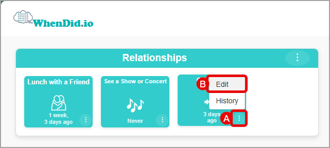
- Click the menu icon (three dots) in the bottom right corner of the action button you want to customize.
- Select Edit from the menu. The Edit Action Button drawer will open.
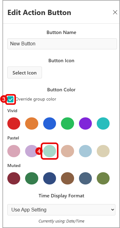
- Scroll down to the Button Color section (this section only appears for Premium users), and check the Override group color checkbox to enable individual color selection.
- Once enabled, you'll see the available color palettes: Vivid colors, Pastel, and Muted colors all appear. Click on any color to select it for this specific button.
- Click Save to apply your color choice.
How Action Button Colors Work
By default, all action buttons inherit their color from their parent group:
- Group color inheritance: New buttons automatically use their group's color theme
- Consistent appearance: All buttons in a group look uniform and organized
- Automatic updates: If you change the group color, all buttons without individual color overrides will update automatically
Premium Color Override
With Premium access, you can override the group color for individual buttons:
- Individual customization: Set unique colors for specific buttons
- Same color options: Access to all 18 color themes (Vivid, Pastel, and Muted)
- Visual emphasis: Make important buttons stand out from the group
- Flexible organization: Mix and match colors within groups as needed
Available Color Options
When overriding button colors, you have access to the same 18 color themes available for groups:
Vivid Colors
Bold, high-energy colors with white text:
- Crimson, Tangerine, Royal Blue, Emerald, Violet, Turquoise
Pastel Colors
Soft, gentle colors with dark text:
- Blush, Lavender, Mint, Peach, Sky, Cream
Muted Colors
Sophisticated, calm colors with white text:
- Burgundy, Forest, Navy, Espresso, Slate, Olive
Using Group Color vs Override Color
When to use group color (default):
- Consistent organization: Keep buttons visually grouped by activity type
- Clean appearance: Maintain a uniform look within each group
- Easy management: Change all buttons at once by updating the group color
When to override button color:
- Priority emphasis: Make critical or frequently-used buttons stand out
- Category distinction: Use different colors for subcategories within a group
- Personal preference: Customize favorite buttons with preferred colors
- Status indication: Use colors to indicate different states or types of activities
Premium Feature Notice
Action button color override is a Premium feature. If you don't have Premium access, the Button Color section will not appear in the Edit Action Button window. Free users can still benefit from group-level color organization using the six available Vivid colors.
Color Management Tips
- Use sparingly: Too many different colors can create visual chaos
- Be consistent: If you override colors, consider using a consistent system (e.g., Navy for work, Sky for house and home)
- Consider contrast: All color combinations are designed for readability, but choose colors that work well together
- Test different combinations: Experiment to find what works best for your workflow
- Remember inheritance: Buttons without overrides will always inherit their group color